A note on the name ‘Lost&Found’
The name Lost&Found comes from the idea that we all live on a continuum of mental health that can change throughout our lives: Sometimes we feel lost, and sometimes we feel found. There is no space between the words and the ampersand to represent the idea that the distance between feeling lost and feeling found is often not great. There is both hope and caution in that short distance: We can move from one to the other more easily than we might think. Both the “lost” and the “found” can work to maintain or improve their own and others’ mental health.
Lost&Found logo
Below is the logo of the Lost&Found nonprofit organization. It can be in one of six variations, depending on what works better for the space and background color. Include the registration symbol (®) for most uses. (The exception is if it is too small to be legible.) Right-click on the image to download a logo.
Stacked, red ampersand with black text
Stacked, all black

Stacked, all white

Horizontal, red ampersand with black text

Horizontal, all black

Horizontal, all white
The Ampersand
The Ampersand, part of the Lost&Found logo, can also be used as a design element. The shape of the Ampersand contains the letters “L” and “F”. The Ampersand, by itself, also represents the larger Lost&Found organization, its programming, and/or its services. The ampersand by itself is not yet registered, so there is no alternate version with a registration symbol.
The Ampersand can only be L&F Red, black or white. The Ampersand can be used with a different color by putting it (in L&F Red, black, or white—whichever looks best and has enough contrast) over a circle or square in a different color.
Right-click on an image below to download it.

Lost&Found Ampersand, L&F Red

Lost&Found Ampersand, black

Lost&Found Ampersand, white
Lost&Found colors
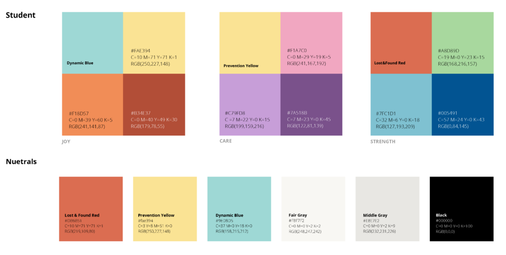
Lost&Found’s primary colors are Lost&Found Red, Prevention Yellow, and Dynamic Blue. Other colors may be added for specific uses. Values for these colors are listed.
Lost & Found Red
#DB6B51
C=10 M=71 Y=71 K=1
RGB(219,109,80)
Prevention Yellow
#FAE394
C=3 Y=8 M=51 K=0
RGB(250,227,148)
Dynamic Blue
#9ED8D5
C=37 M=0 Y=18 K=0
RGB(158,215,212)
Color palette
Consistent color usage is integral to maintaining a cohesive brand. Lost&Found’s primary colors each serve a greater purpose tying to the company’s values. Use the additional values to complement our main colors.
Lost&Found Red nods at the origins of Lost&Found itself, a student movement started in South Dakota with the mission to connect young adults with the skills and community for lifelong resilience.
Dynamic Blue represents our value of change, vitality, as well as depth and understanding.
Prevention Yellow reflects Lost&Found’s commitment to suicide prevention, warmth, and hope.
Accent palettes
Each palette has a unique story that ties into Lost&Found’s mission. Use the accent palettes In materials directed towards students, and the formal palette towards our business professional settings. These palettes complement our primary colors, and should never be the predominant colors for any formal material.

